
A strong brand is far more than a logo. It’s the sum of every visual, tonal, and emotional impression your business leaves across multiple touchpoints. From a website header to an Instagram post, from packaging to video intros, every element communicates something about who you are and what you stand for.
The challenge today lies in building a visual identity that not only looks beautiful but also works consistently across screens, formats, and moments of interaction.
A Logo Is Just the Beginning of Your Visual Language
Many brands start with a logo as if it alone could define them. While a logo is an important symbol, it’s only one part of a much larger visual language.
A complete visual identity system establishes rules for colors, typography, composition, shapes, imagery, and even motion. When designed well, this system becomes recognizable even without the logo present.
Think about Netflix’s red gradient or Spotify’s green circular motif. They both are unmistakable, even when their logos are hidden. That’s the power of a system: it builds recognition and consistency across every channel.

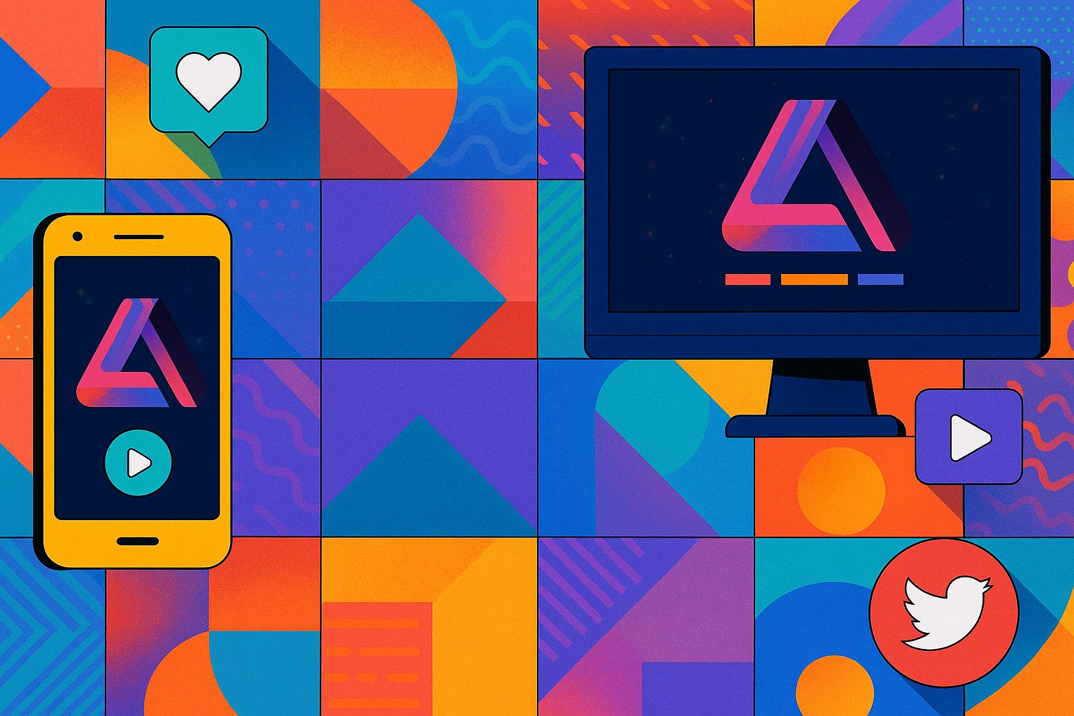
Designing a Digital-First Brand Identity
Most brand experiences today begin on a screen such as a website, social media post, email, or app. This means your identity must be digital-first, not a retrofitted print logo.
Digital design demands flexibility:
- Create multiple logo versions (horizontal, stacked, icon-only)
- Ensure typography remains legible across devices
- Build color palettes that maintain contrast and accessibility
The best identities scale seamlessly, from a favicon on a browser tab to a billboard on a highway.

Why Motion Design Is Essential for Modern Brands
Modern brands don’t live in static spaces anymore, they move. Motion adds personality and emotion to your brand.
Subtle animations, hover effects, and transitions bring your identity to life. A logo reveal, a scroll animation, or a motion pattern can subconsciously reinforce your brand’s tone.
Match your motion style to your brand’s character:
- Smooth and minimal → luxury brands
- Bold and energetic → youth brands
- Precise and technical → tech or innovation brands
Responsive Design: Consistency Across All Devices
Responsive design is key to maintaining trust and professionalism. Avoid fixed proportions and embrace flexible grids and adaptable layouts. A consistent experience across screen sizes signals reliability and care for the user.
Adapting Your Digital Identity to Print
Even in a digital-first world, physical materials still matter. Business cards, packaging, and signage are tangible extensions of your identity.
When translating to print:
- Test colors in both RGB and CMYK
- Adjust type hierarchy for larger formats
- Focus on translation, not duplication, preserve essence, not just replicate visuals.
The Role of Photography and Imagery in Brand Identity
While colors and typography define structure, images define emotion. They shape how people feel about your brand before reading a single word.
To maintain a consistent photographic style, pay attention to:
- Lighting and tone
- Framing and composition
- Color treatment and post-processing
Even a subtle signature hue or contrast level becomes part of your visual fingerprint. When imagery aligns with your design system, your brand feels more intentional and trustworthy.

Testing Your Visual Identity Across Platforms
Testing across platforms separates good brands from great ones. A visual identity isn’t complete until it’s tested in real-life contexts.
Prototype your brand in:
- Social media templates
- App interfaces
- Video intros
- Email campaigns
- Print materials
Testing reveals opportunities to simplify and refine, a hallmark of professional design.
Keep Your Visual Identity Evolving
A successful visual identity is designed to evolve over time. Brands grow, audiences shift, and technologies change.
Your system should be flexible enough to refresh colors, update imagery, or adapt typography for new formats without losing recognition.
Consistency doesn’t mean staying static, it means preserving coherence through transformation.

Connection Over Perfection
Creating a visual identity that works on every platform isn’t just about rules, it’s about meaning. Every design element, from your typography to your animations, should express a unified visual language. When your brand feels coherent, it builds trust. When it builds trust, it earns recognition.
The best brands aren’t the loudest. They are the ones that feel intentional, authentic, and connected at every touchpoint.