We are thrilled to introduce you to one of the major projects of last year, the rebrand of SHTET- Shkolla Teknike Ekonomike Tirane.
This rebranding is a significant achievement for our company, as this school has decided to change its image with the new logo after 75 years!
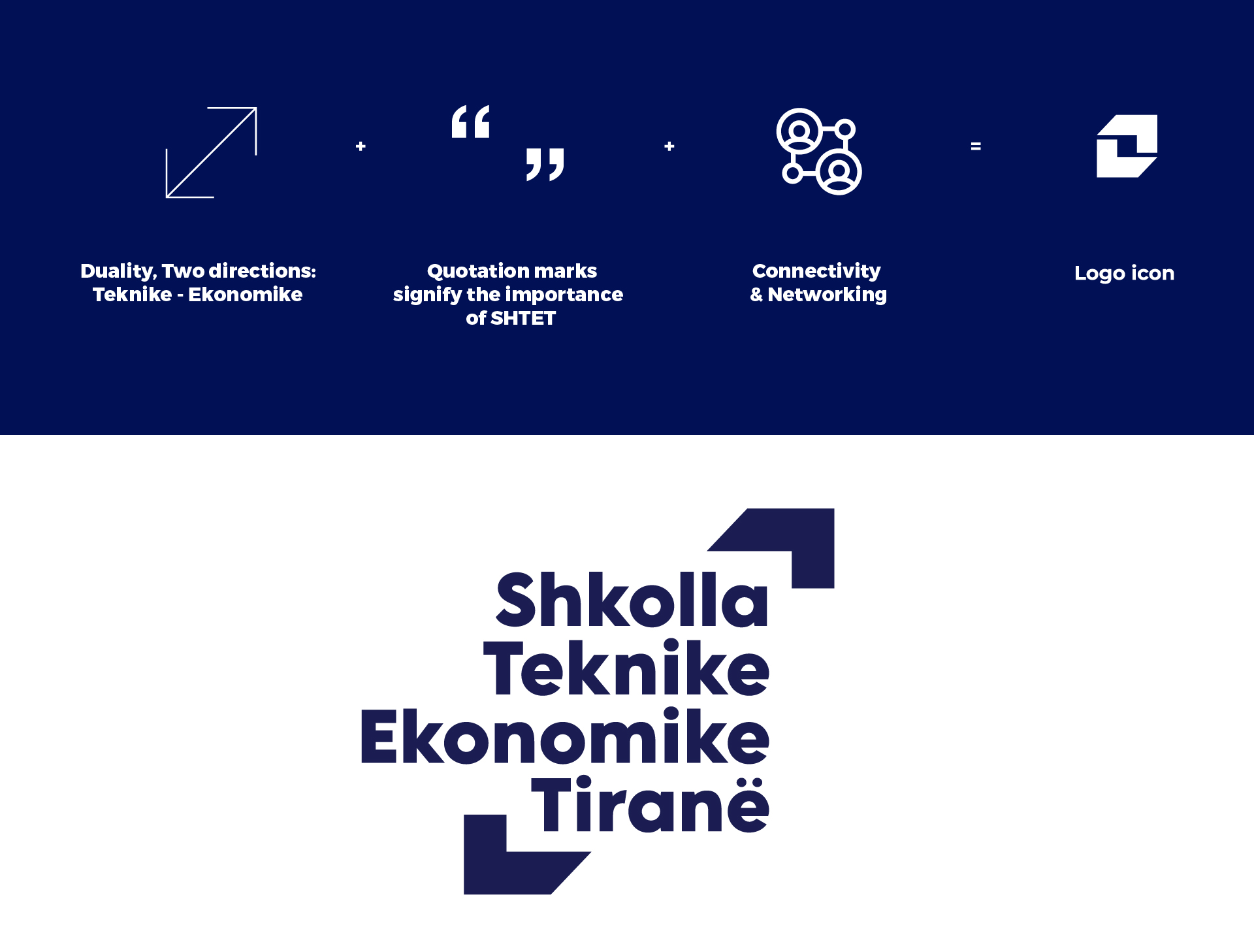
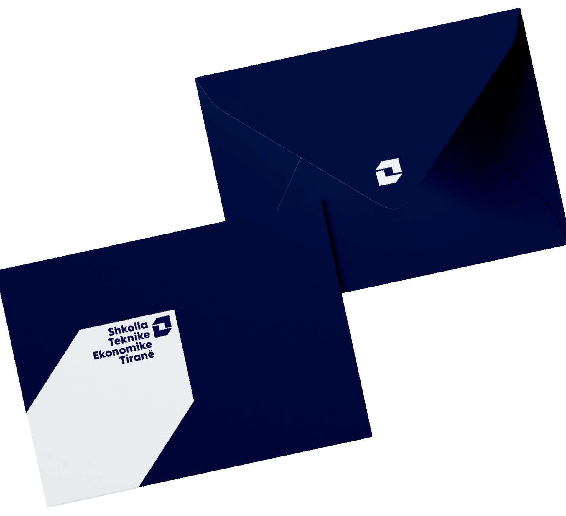
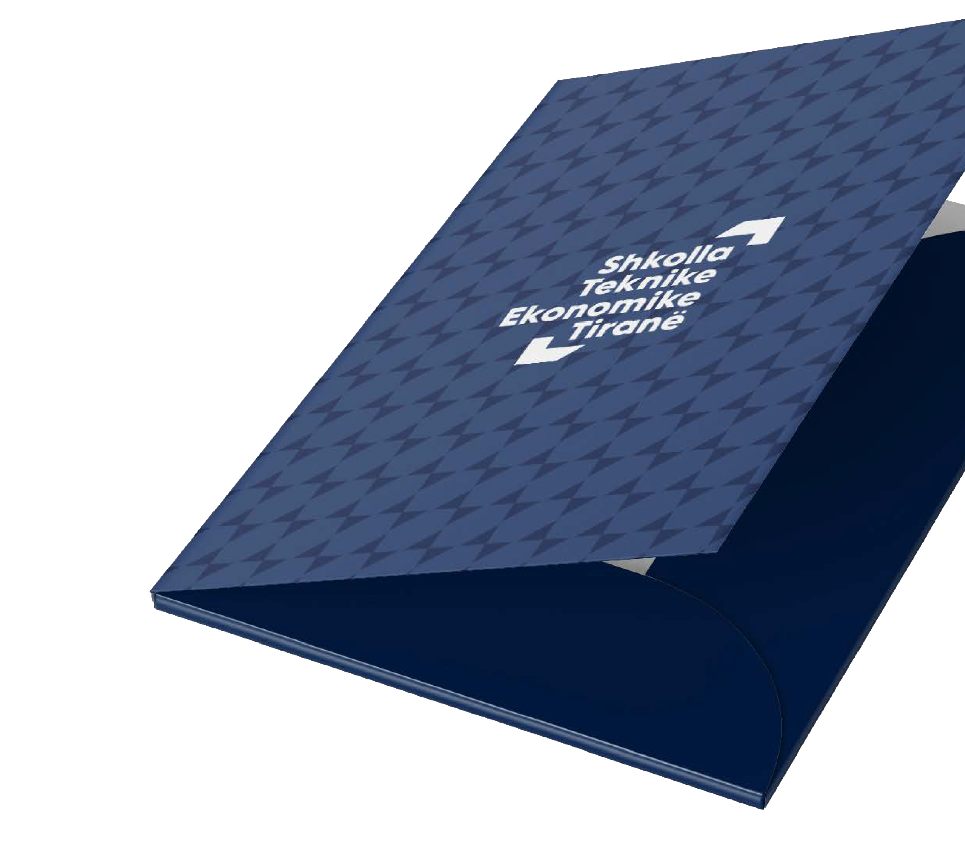
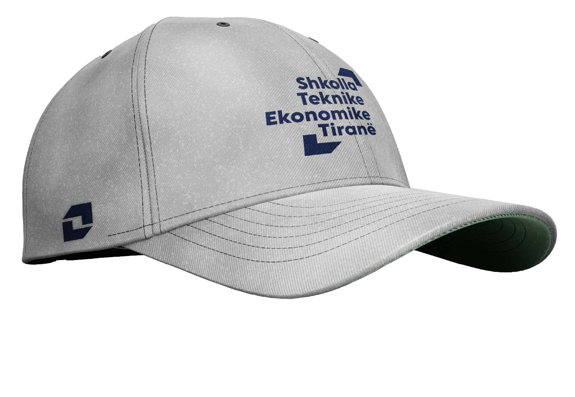
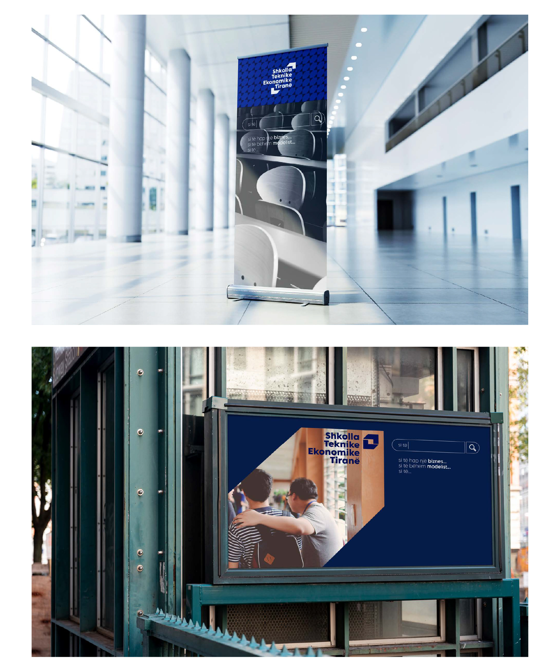
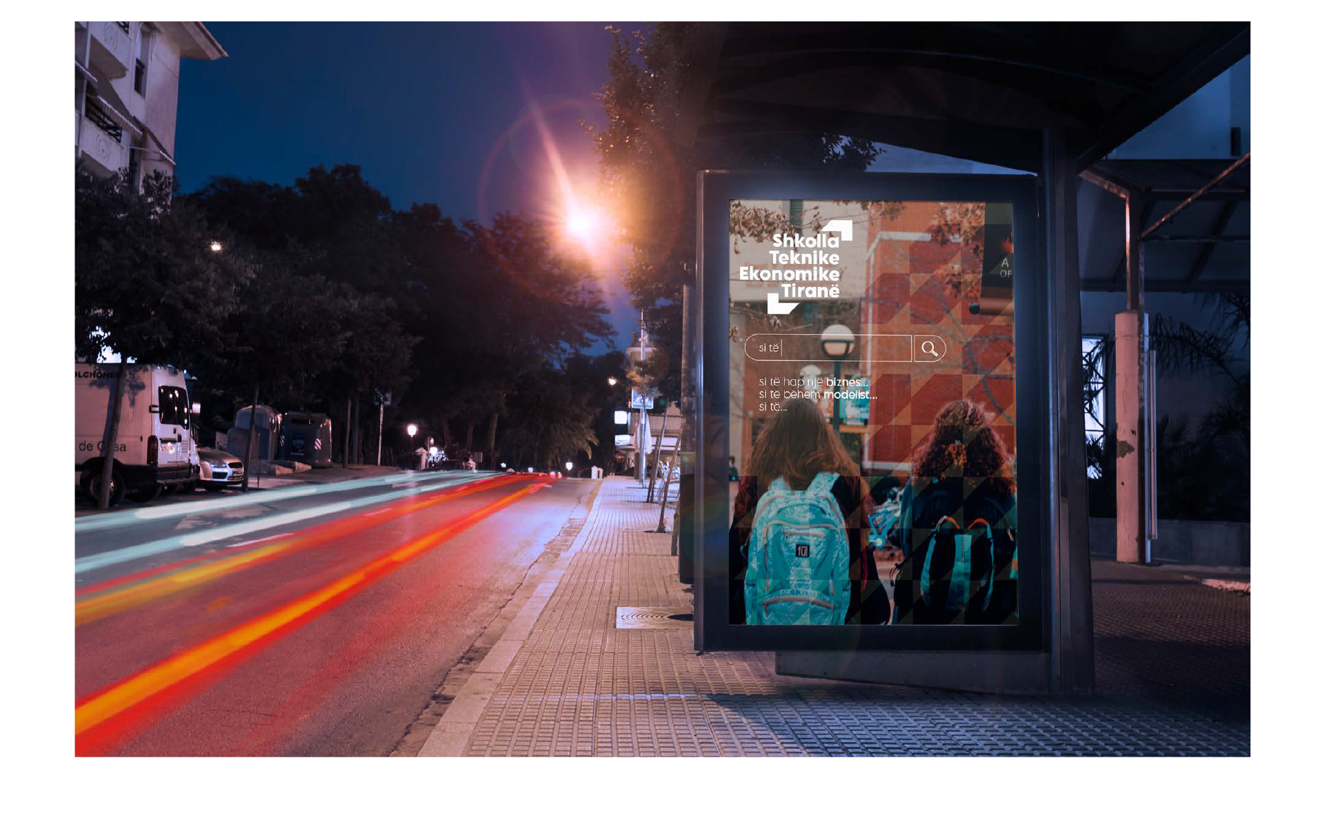
The new logo of SHTET is a simple yet elegant combination of elements that represent the technical and economic school. The logo consists of two main elements: a symbolic arrow that signifies duality and two directions “technicality and economics” – fields that are the foundation of the school; the quotation marks that signify the importance of the expression and connectivity!
Our team of designers researched and made sure that the combination of elements creates a powerful and modern logo that reflects the school’s values: professionalism, innovation, and creativity. The logo is designed in a strong navy blue color that represents trust and stability, while the white elements give it a stable and serious feeling.
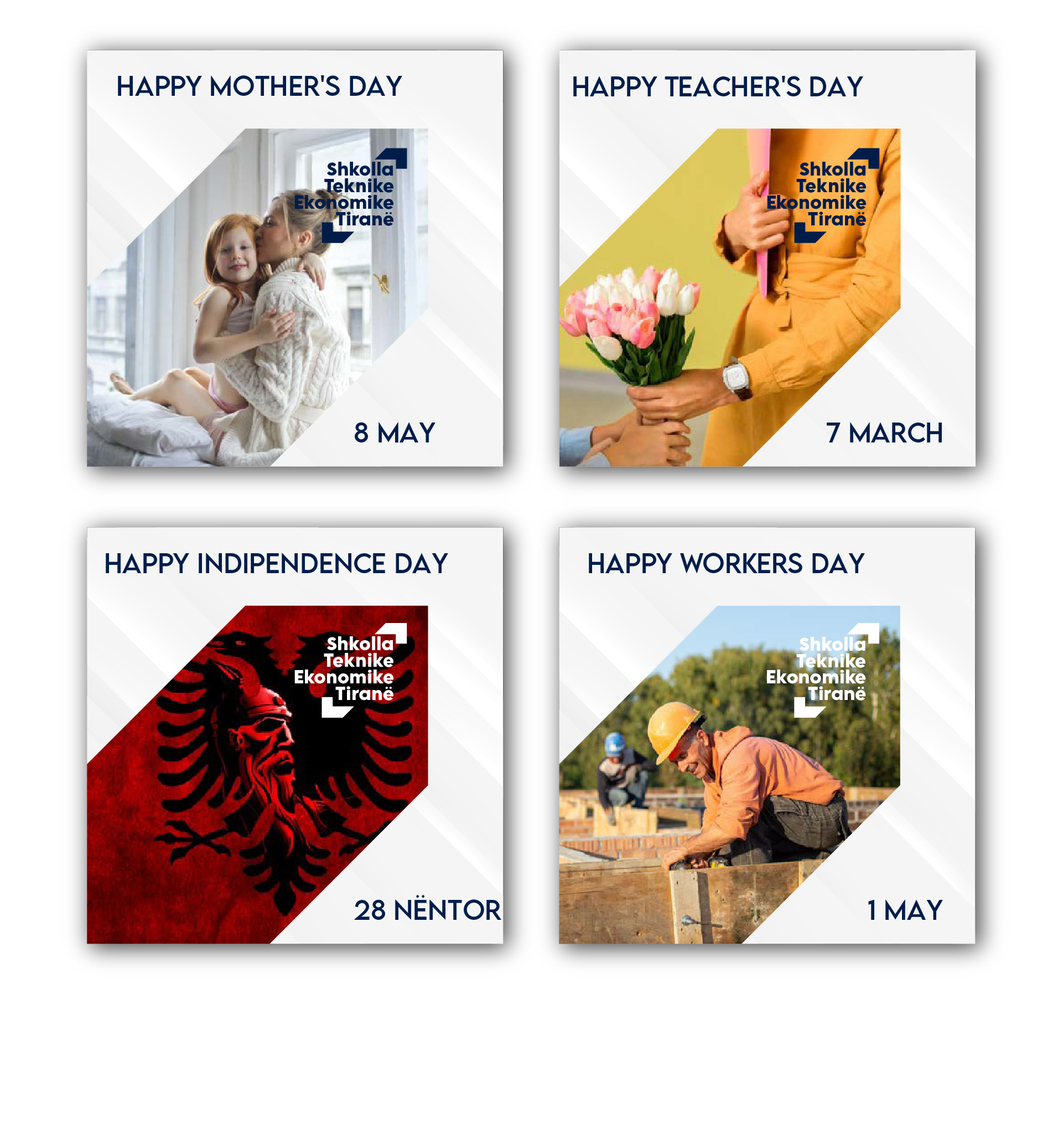
The logo is a powerful symbol of SHTET’s identity, representing a strong commitment to quality and professionalism in the education of the textile field, technology, and economy.