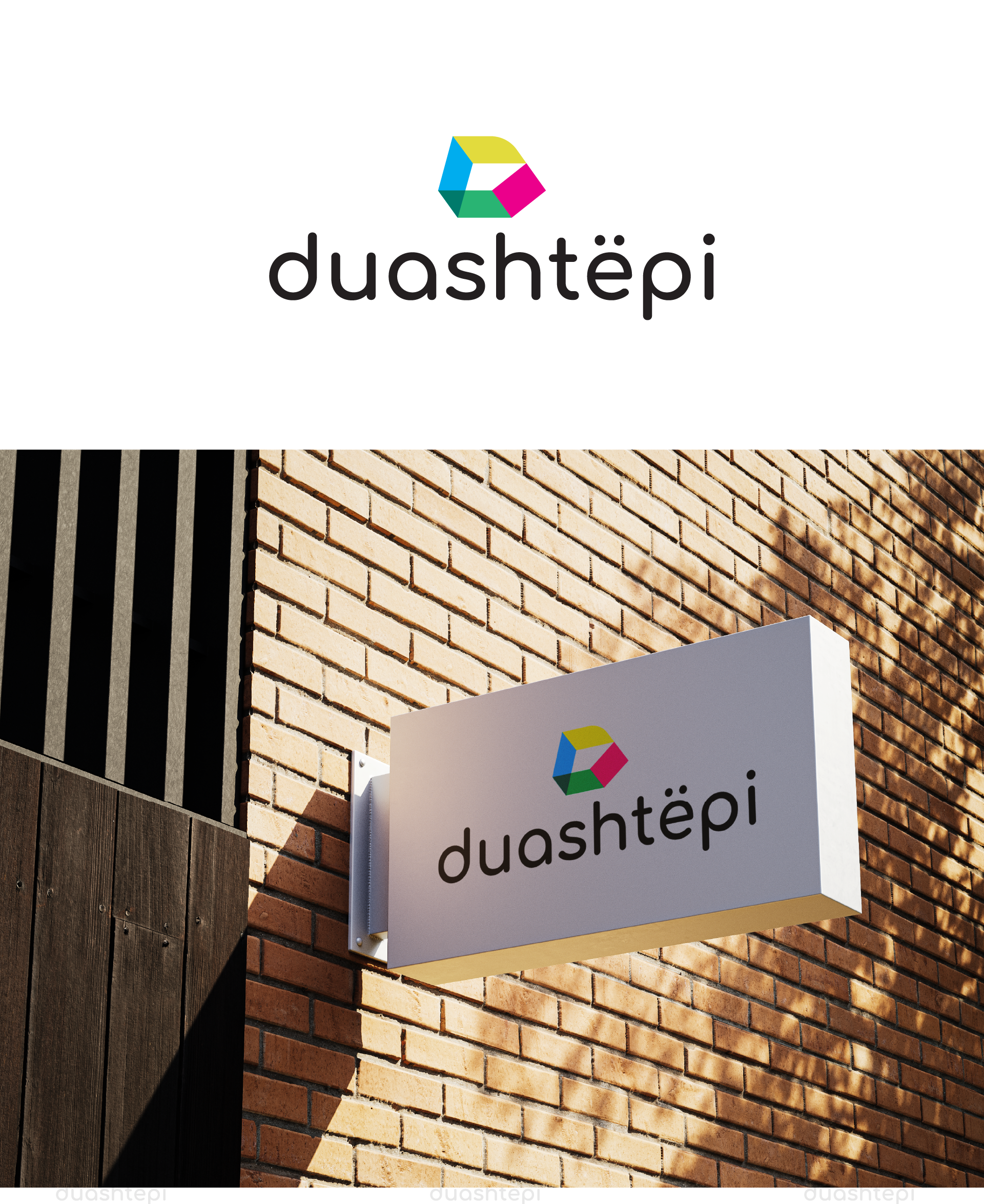
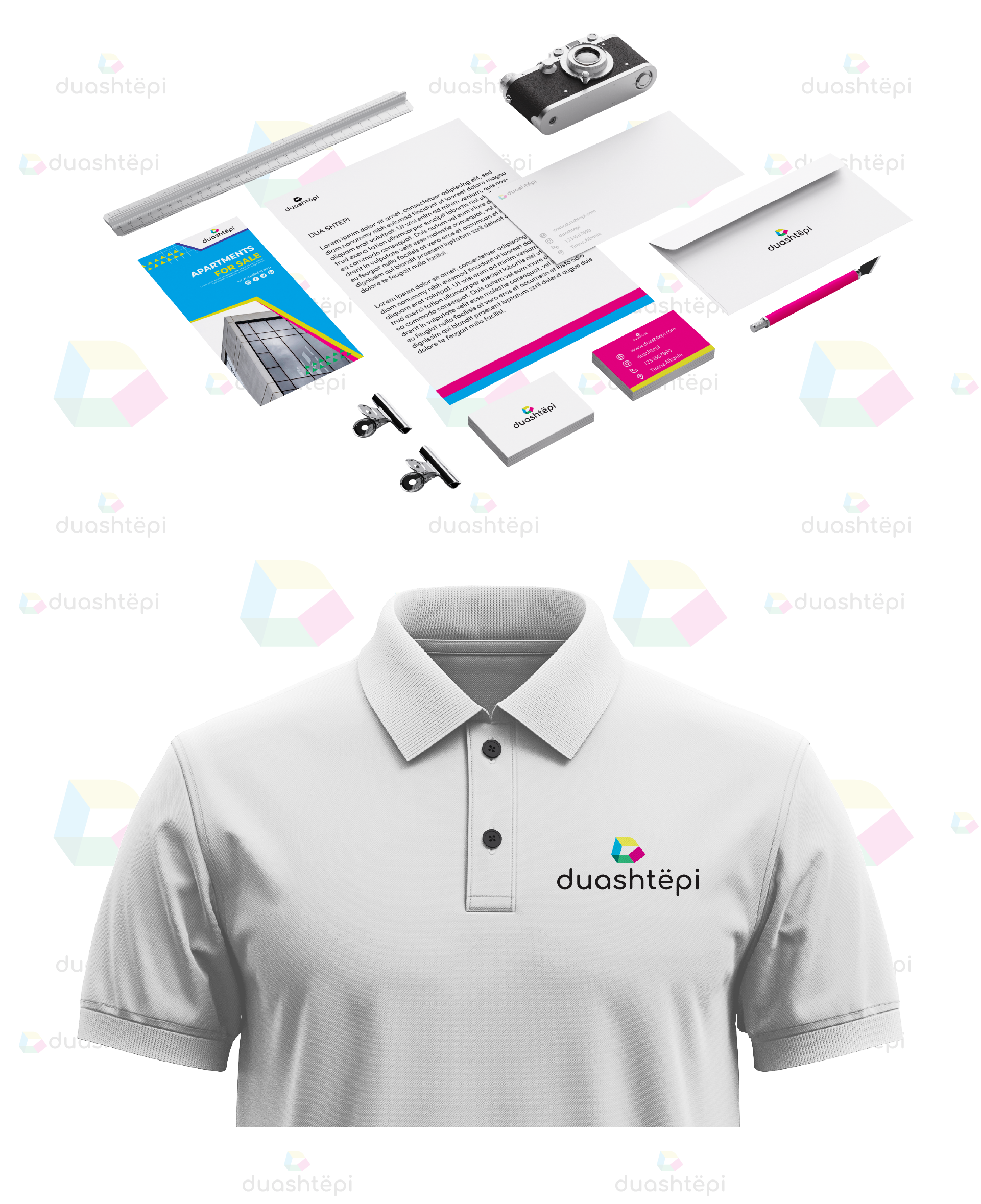
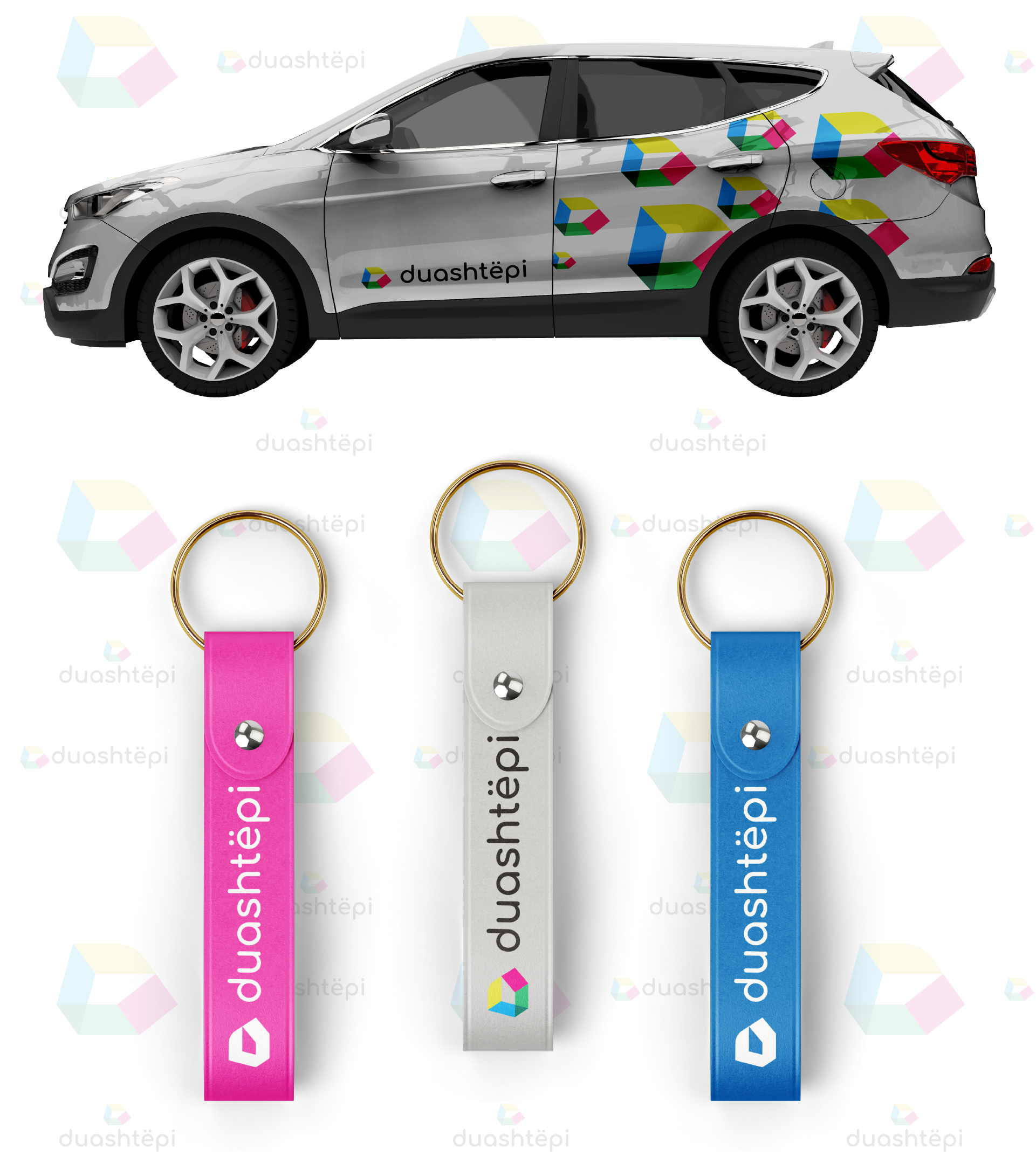
Building a trusting, easily memorable brand identity that differentiates from other real estate agencies, was our initial idea. Inspired by the idea of the “arrow” and the “house” we created the “duashtepi” logo icon… an icon that displays 4 colorfull layers representing apartments, villas, land and commercial units. It is also positioned as an “entering icon” which symbolises the new occasions that the clients may experience. Also, it was very important for our designers that the brand positioning was categorized separately, in order to properly function on all communication channels. We present to you the @duashtepi.al brand identity!